Look, sound and comfort
Choose a calm or a playful look, and adjust the small settings that make long practice sessions more comfortable.
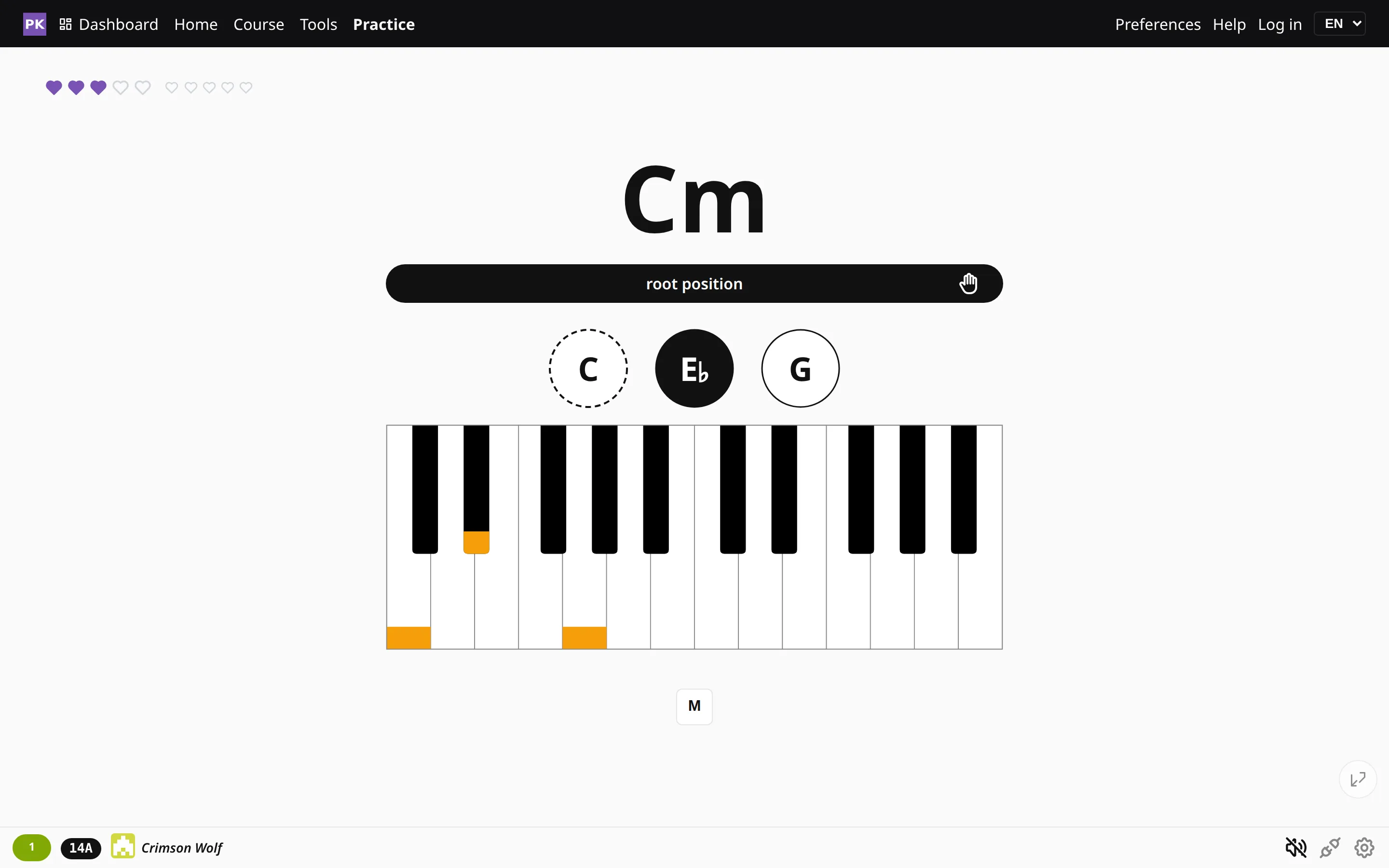
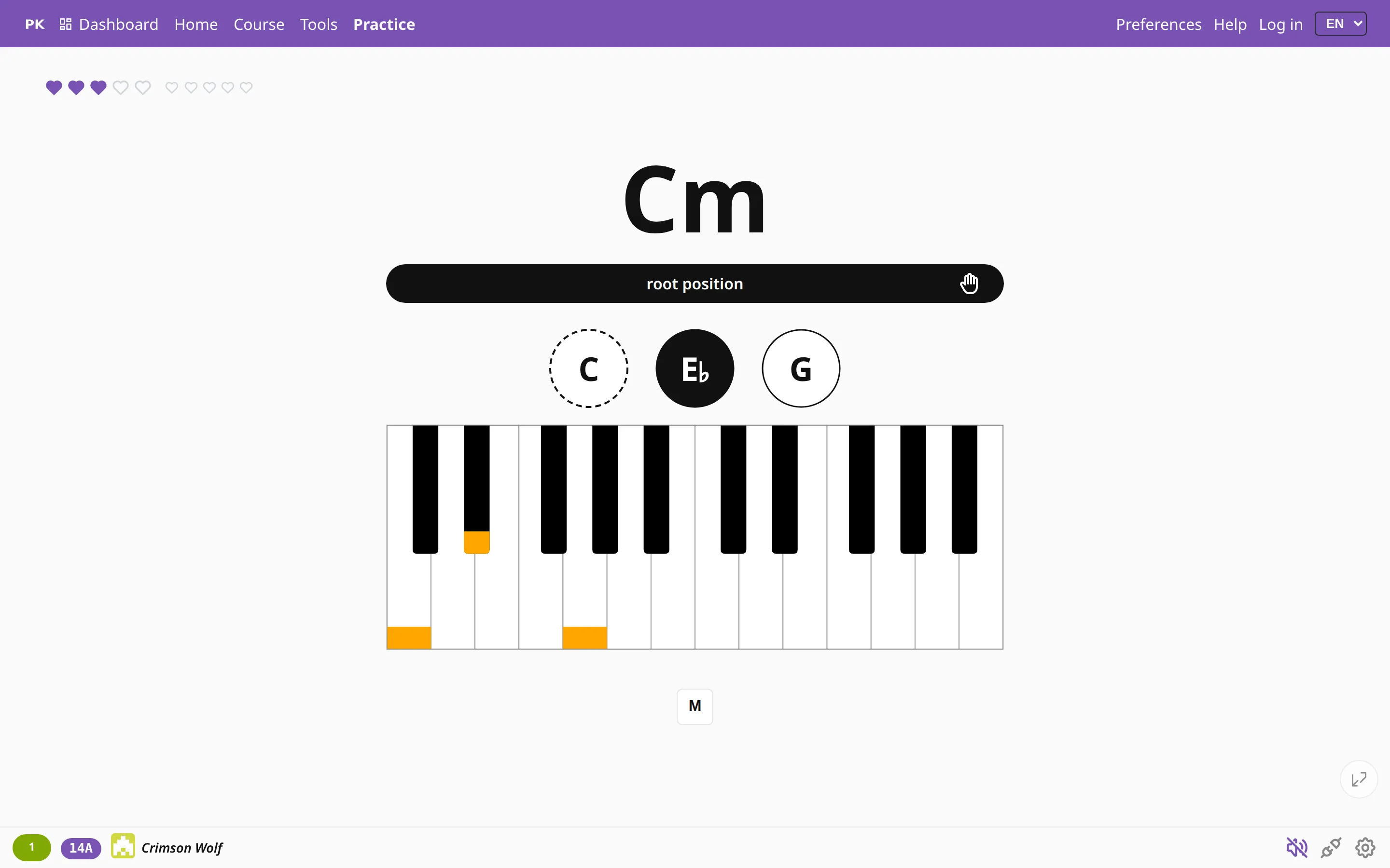
Professional or Playful
There are two themes. Professional is plain, with black bars and a single accent color, so nothing draws attention away from the chord. Playful uses violet, orange and green, which children (and plenty of adults) tend to like more. Only the colors change; every screen, button and shortcut stays where it was.
More display settings
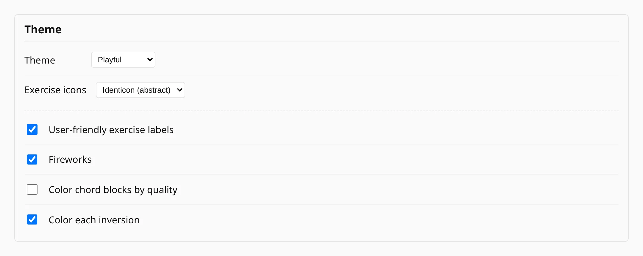
Next to the theme in Preferences you will also find these:
- Exercise icons gives each exercise a picture of its own, either an abstract pattern or a little robot, or you can turn the pictures off.
- User-friendly exercise labels shows names like “Major triads, white keys” instead of the technical shorthand.
- Fireworks celebrate when you finish something. If your computer is set to reduce motion, they start switched off.
- Color chord blocks by quality and color each inversion use color as a cue. Leave them off for plain black if you would rather read the names.
For long practice sessions
- With Keep screen awake on, a tablet on the music stand does not go dark halfway through a scale.
- In full-screen practice the menus slide away and come back when you move the mouse to the edge of the screen.
- The piano and the metronome have separate volume controls, and for late-night practice you can have a metronome you watch instead of hear.
- The chord queue’s animation can be switched off, and the app follows your system’s reduced-motion setting.
- For bigger text, use your browser’s zoom (Ctrl++) and the pages reflow to fit.
Everything from the keyboard
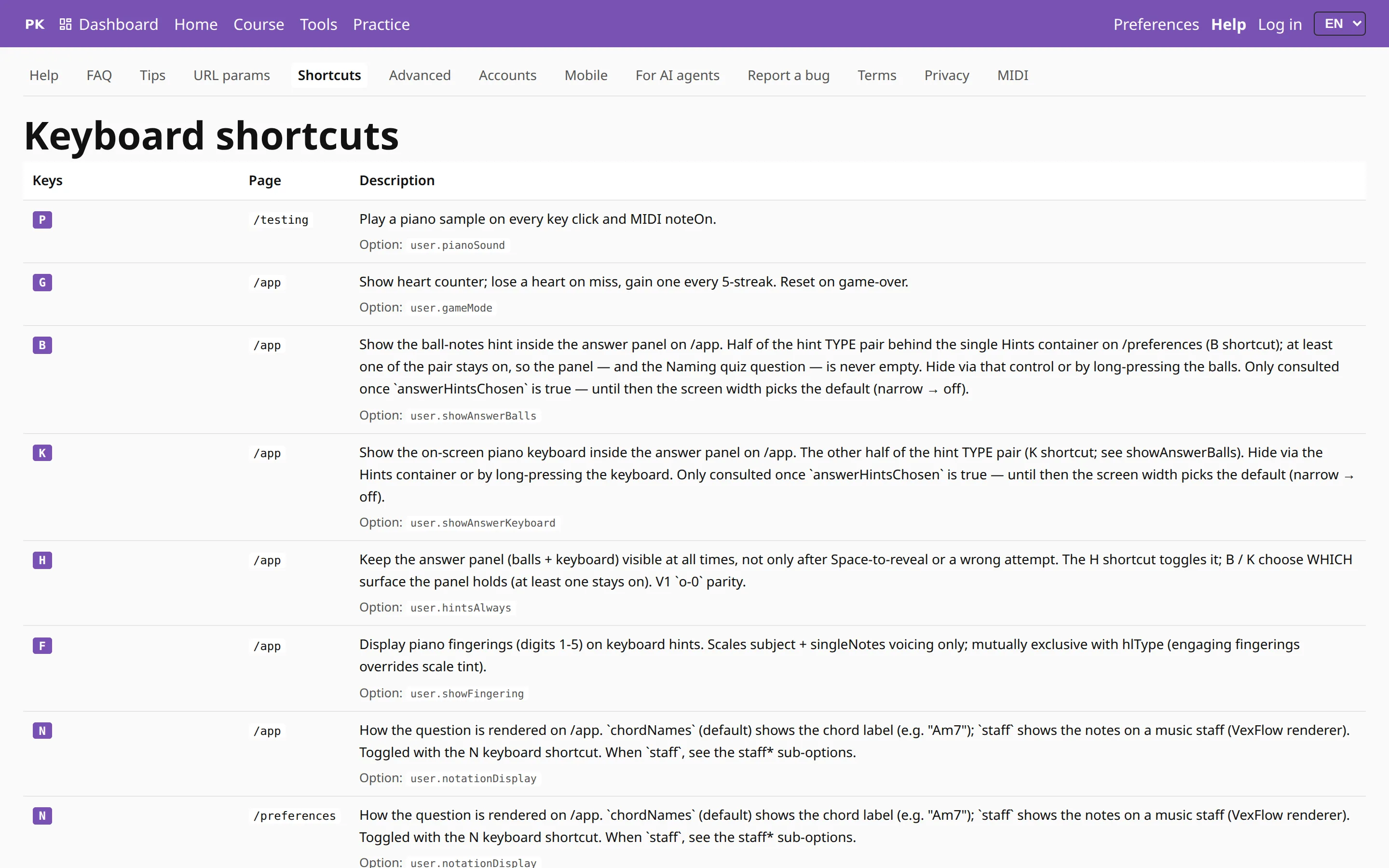
You can practice without touching the mouse. Reveal, next, metronome, tempo, hints, key changes and inversions each have a key, and all the shortcuts are listed on one help page. It is quicker, and your hands can stay on the MIDI keyboard.